
Use Tailwind without Tailwind
Helmuth Saatkamp · September 6, 2022
Tailwind is one of those very controversial things, some people argue that it is the best since sliced bread, others it is a tool sent by the devil itself. Nonetheless, this is not an article about if you should use it or not, there are already plenty of those articles about the pros and cons on the internet.
What makes Tailwind good is the documentation, you may not agree on the “naming” but for every class that you can use there is an equivalent showing how to use it with CSS, for that, the team has done an outstanding job.
Tailwind is super fun to work with after you pass the initial learning threshold, but as a Developer, you still need to understand CSS to use it correctly.
CSS is not hard nor is broken.
In the end, it is just a tool to help you to write CSS, and as a tool, it limits the options of what you could do, for example, you would never be able to use a custom grid layout with Tailwind only, as the one below:
| Mobile | Desktop |
|---|---|
 |  |
Source: https://webkit.org/demos/css-grid/
In this article, you will learn how to use Tailwind documentation to write your CSS styles. The following topics will be discussed:
The idea is to have the full power to write your CSS together with the cool ideas and patterns created by the Tailwind team. So let's get started.
Preflight
Preflight is a set of base styles for Tailwind projects that are designed to smooth over cross-browser inconsistencies and make it easier for you to work within the constraints of your design system.
Here you have basically to copy the preflight.css created by them.
/* preflight.css */
*,
::before,
::after {
  box-sizing: border-box;
  border-width: 0;
  border-style: solid;
  border-color: currentcolor;
}

html {
  line-height: 1.5;
  text-size-adjust: 100%;
  tab-size: 4;
  font-family: system-ui;
}

body {
  margin: 0;
  line-height: inherit;
}

hr {
  height: 0;
  color: inherit;
  border-top-width: 1px;
}

abbr:where([title]) {
  text-decoration: underline dotted;
}

h1,
h2,
h3,
h4,
h5,
h6 {
  font-size: inherit;
  font-weight: inherit;
}

a {
  color: inherit;
  text-decoration: inherit;
}

b,
strong {
  font-weight: bolder;
}

code,
kbd,
samp,
pre {
  font-family:
    "fontFamily.mono",
    ui-monospace,
    SFMono-Regular,
    Menlo,
    Monaco,
    Consolas,
    "Liberation Mono",
    "Courier New",
    monospace;
  font-size: 1em;
}

small {
  font-size: 80%;
}

sub,
sup {
  font-size: 75%;
  line-height: 0;
  position: relative;
  vertical-align: baseline;
}

sub {
  bottom: -0.25em;
}

sup {
  top: -0.5em;
}

table {
  text-indent: 0;
  border-color: inherit;
  border-collapse: collapse;
}

button,
input,
optgroup,
select,
textarea {
  font-family: inherit;
  font-size: 100%;
  font-weight: inherit;
  line-height: inherit;
  color: inherit;
  margin: 0;
  padding: 0;
}

button,
select {
  text-transform: none;
}

button,
[type="button"],
[type="reset"],
[type="submit"] {
  appearance: button;
  background-color: transparent;
  background-image: none;
}

:-moz-focusring {
  outline: auto;
}

:-moz-ui-invalid {
  box-shadow: none;
}

progress {
  vertical-align: baseline;
}

::-webkit-inner-spin-button,
::-webkit-outer-spin-button {
  height: auto;
}

[type="search"] {
  appearance: textfield;
  outline-offset: -2px;
}

::-webkit-search-decoration {
  appearance: none;
}

::-webkit-file-upload-button {
  appearance: button;
  font: inherit;
}

summary {
  display: list-item;
}

blockquote,
dl,
dd,
h1,
h2,
h3,
h4,
h5,
h6,
hr,
figure,
p,
pre {
  margin: 0;
}

fieldset {
  margin: 0;
  padding: 0;
}

legend {
  padding: 0;
}

ol,
ul,
menu {
  list-style: none;
  margin: 0;
  padding: 0;
}

textarea {
  resize: vertical;
}

input::placeholder,
textarea::placeholder {
  opacity: 1;
  color: #9ca3af;
}

button,
[role="button"] {
  cursor: pointer;
}

:disabled {
  cursor: default;
}

img,
svg,
video,
canvas,
audio,
iframe,
embed,
object {
  display: block;
  vertical-align: middle;
}

img,
video {
  max-width: 100%;
  height: auto;
}
That's it, just add this CSS to your project.
Theme
The theme file is where you define your project’s color palette, type scale, fonts, breakpoints, border radius values, and more.
This is the most important part, getting the same idea of the tailwind.config.js file where you can customize your theme, create a theme file following the Tailwind definitions:
/* theme.css */
:root {
  --size-0-5: 0.125rem; /* spacing:0.5 */
  --size-1: 0.25rem; /* spacing:1 */
  --size-1-5: 0.375rem; /* spacing:1.5 */
  --size-2: 0.5rem; /* spacing:2 */
  --size-2-5: 0.625rem;
  --size-3: 0.75rem;
  --size-3-5: 0.875rem;
  --size-4: 1rem;
  --size-5: 1.25rem;
  --size-6: 1.5rem;
  --size-7: 1.75rem;
  --size-8: 2rem;
  --size-9: 2.25rem;
  --size-10: 2.5rem;
  --size-11: 2.75rem;
  --size-12: 3rem;
  --size-14: 3.5rem;
  --size-16: 4rem;
  --size-20: 5rem;
  --size-24: 6rem;
  --size-28: 7rem;
  --size-32: 8rem;
  --size-36: 9rem;
  --size-40: 10rem;
  --size-44: 11rem;
  --size-48: 12rem;
  --size-52: 13rem;
  --size-56: 14rem;
  --size-60: 15rem;
  --size-64: 16rem;
  --size-72: 18rem;
  --size-80: 20rem;
  --size-96: 24rem;
  --size-xs: 20rem; /* 320px */
  --size-sm: 24rem; /* 384px */
  --size-md: 28rem; /* 448px */
  --size-lg: 32rem; /* 512px */
  --size-xl: 36rem; /* 576px */
  --size-2xl: 42rem; /* 672px */
  --size-3xl: 48rem; /* 768px */
  --size-4xl: 56rem; /* 896px */
  --size-5xl: 64rem; /* 1024px */
  --size-6xl: 72rem; /* 1152px */
  --size-7xl: 80rem; /* 1280px */
  --size-full: 100%;
  --size-fit: fit-content;
  --size-min: min-content;
  --size-max: max-content;
  --size-auto: auto;
  --size-none: none;
  --size-prose: 65ch;
  --size-screen-width: 100vw;
  --size-screen-height: 100vh;
  --size-screen-xs: 480px;
  --size-screen-sm: 640px;
  --size-screen-md: 768px;
  --size-screen-lg: 1024px;
  --size-screen-xl: 1280px;
  --size-screen-2xl: 1536px;
  --grid-1: repeat(1, minmax(0, 1fr));
  --grid-2: repeat(2, minmax(0, 1fr));
  --grid-3: repeat(3, minmax(0, 1fr));
  --grid-4: repeat(4, minmax(0, 1fr));
  --grid-5: repeat(5, minmax(0, 1fr));
  --grid-6: repeat(6, minmax(0, 1fr));
  --grid-7: repeat(7, minmax(0, 1fr));
  --grid-8: repeat(8, minmax(0, 1fr));
  --grid-9: repeat(9, minmax(0, 1fr));
  --grid-10: repeat(10, minmax(0, 1fr));
  --grid-11: repeat(11, minmax(0, 1fr));
  --grid-12: repeat(12, minmax(0, 1fr));
  --border: 1px;
  --border-0: 0;
  --border-2: 2px;
  --border-4: 4px;
  --border-8: 8px;
  --ring: 0 0 0 var(--border);
  --ring-2: 0 0 0 var(--border-2);
  --ring-4: 0 0 0 var(--border-4);
  --ring-8: 0 0 0 var(--border-8);
  --rounded: 0.25rem;
  --rounded-sm: 0.125rem;
  --rounded-md: 0.375rem;
  --rounded-lg: 0.5rem;
  --rounded-xl: 0.75rem;
  --rounded-2xl: 1rem;
  --rounded-3xl: 1.5rem;
  --rounded-full: 9999px;
  --shadow: 0 1px 3px 0 rgb(0 0 0 / 10%), 0 1px 2px -1px rgb(0 0 0 / 10%);
  --shadow-sm: 0 1px 2px 0 rgb(0 0 0 / 5%);
  --shadow-md: 0 4px 6px -1px rgb(0 0 0 / 10%), 0 2px 4px -2px rgb(0 0 0 / 10%);
  --shadow-lg: 0 10px 15px -3px rgb(0 0 0 / 10%), 0 4px 6px -4px rgb(0 0 0 / 10%);
  --shadow-xl: 0 20px 25px -5px rgb(0 0 0 / 10%), 0 8px 10px -6px rgb(0 0 0 / 10%);
  --shadow-2xl: 0 25px 50px -12px rgb(0 0 0 / 25%);
  --shadow-inner: inset 0 2px 4px 0 rgb(0 0 0 / 5%);
  --font-weight-thin: 100;
  --font-weight-extralight: 200;
  --font-weight-light: 300;
  --font-weight-normal: 400;
  --font-weight-medium: 500;
  --font-weight-semibold: 600;
  --font-weight-bold: 700;
  --font-weight-extrabold: 800;
  --font-weight-black: 900;
  --line-spacing-xs: 1rem;
  --line-spacing-sm: 1.25rem;
  --line-spacing-md: 1.5rem;
  --line-spacing-lg: 1.75rem;
  --line-spacing-xl: 1.75rem;
  --line-spacing-2xl: 2rem;
  --line-spacing-3xl: 2.25rem;
  --line-spacing-4xl: 2.5rem;
  --line-spacing-5xl: 1;
  --line-spacing-6xl: 1;
  --line-spacing-7xl: 1;
  --line-spacing-8xl: 1;
  --line-spacing-9xl: 1;
  --text-xs: 0.75rem;
  --text-sm: 0.875rem;
  --text-md: 1rem;
  --text-lg: 1.125rem;
  --text-xl: 1.25rem;
  --text-2xl: 1.5rem;
  --text-3xl: 1.875rem;
  --text-4xl: 2.25rem;
  --text-5xl: 3rem;
  --text-6xl: 3.75rem;
  --text-7xl: 4.5rem;
  --text-8xl: 6rem;
  --text-9xl: 8rem;
  --color-canvas: #f9fafb; /* gray:50 */
  --color-contrast: #27272a; /* zinc:800 */
  --color-contrast-50: #fafafa; /* zinc:50 */
  --color-contrast-100: #f4f4f5; /* zinc:100 */
  --color-contrast-200: #e4e4e7; /* zinc:200 */
  --color-contrast-300: #d4d4d8; /* zinc:300 */
  --color-contrast-400: #a1a1aa; /* zinc:400 */
  --color-contrast-500: #71717a; /* zinc:500 */
  --color-contrast-600: #52525b; /* zinc:600 */
  --color-contrast-700: #3f3f46; /* zinc:700 */
  --color-contrast-800: #27272a; /* zinc:800 */
  --color-contrast-900: #18181b; /* zinc:900 */
  --color-primary-backdrop: #bfdbfe; /* blue:200 */
  --color-primary-focus: #93c5fd; /* blue:300 */
  --color-primary: #2563eb; /* blue:600 */
  --color-primary-content: #1e40af; /* blue:800 */
  --color-primary-contrast: #fff;
  --color-error-backdrop: #fecdd3; /* rose:200 */
  --color-error-focus: #fda4af; /* rose:300 */
  --color-error: #f43f5e; /* rose:600 */
  --color-error-content: #9f1239; /* rose:800 */
  --color-error-contrast: #fff;
  --color-success-backdrop: #bbf7d0; /* green:200 */
  --color-success-focus: #86efac; /* green:300 */
  --color-success: #22c55e; /* green:600 */
  --color-success-content: #166534; /* green:800 */
  --color-success-contrast: #fff;
  --color-content-heading: #111827; /* gray:900 */
  --color-content-body: #1f2937; /* gray:800 */
  --color-content-secondary: #374151; /* gray:700 */
  --color-content-tertiary: #6b7280; /* gray:500 */
  --color-content-disabled: #9ca3af; /* gray:400 */
  --color-content-contrast: #d1d5db; /* gray:300 */
}

@media (prefers-color-scheme: dark) {
  :root {
    --color-canvas: #27272a; /* zinc:800 */
    --color-contrast: #fff;
    --color-contrast-50: #18181b; /* zinc:900 */
    --color-contrast-100: #27272a; /* zinc:800 */
    --color-contrast-200: #3f3f46; /* zinc:700 */
    --color-contrast-300: #52525b; /* zinc:600 */
    --color-contrast-400: #71717a; /* zinc:500 */
    --color-contrast-500: #a1a1aa; /* zinc:400 */
    --color-contrast-600: #d4d4d8; /* zinc:300 */
    --color-contrast-700: #e4e4e7; /* zinc:200 */
    --color-contrast-800: #f4f4f5; /* zinc:100 */
    --color-contrast-900: #fafafa; /* zinc:50 */
    --color-primary-backdrop: #93c5fd; /* blue:300 */
    --color-primary-focus: #3b82f6; /* blue:500 */
    --color-primary: #2563eb; /* blue:600 */
    --color-primary-content: #1e40af; /* blue:800 */
    --color-primary-contrast: #fff;
    --color-error-backdrop: #fda4af; /* rose:300 */
    --color-error-focus: #f43f5e; /* rose:500 */
    --color-error: #e11d48; /* rose:600 */
    --color-error-content: #9f1239; /* rose:800 */
    --color-error-contrast: #fff;
    --color-success-backdrop: #86efac; /* green:300 */
    --color-success-focus: #22c55e; /* green:500 */
    --color-success: #16a34a; /* green:500 */
    --color-success-content: #166534; /* green:800 */
    --color-success-contrast: #fff;
    --color-content-heading: #f9fafb; /* gray:50 */
    --color-content-body: #e5e7eb; /* gray:200 */
    --color-content-secondary: #d1d5db; /* gray:300 */
    --color-content-tertiary: #6b7280; /* gray:500 */
    --color-content-disabled: #4b5563; /* gray:600 */
    --color-content-contrast: #374151; /* gray:700 */
  }
}

@custom-media --xs (min-width: var(--size-screen-xs));
@custom-media --sm (min-width: var(--size-screen-sm));
@custom-media --md (min-width: var(--size-screen-md));
@custom-media --lg (min-width: var(--size-screen-lg));
@custom-media --xl (min-width: var(--size-screen-xl));
@custom-media --xxl (min-width: var(--size-screen-2xl));
To use those variables, you can declare as follows:
.example {
  padding: var(--size-3); /* p-3 */
  border-radius: var(--rounded-lg); /* rounded-lg */
  box-shadow: var(--shadow-lg); /* shadow-lg */
  font-size: var(--text-sm); /* text-sm */
  line-height: var(--line-spacing-sm); /* text-sm */
}
You can define your CSS variables to have the same values defined in the Tailwind, so you can get through their docs and use their style. But you wouldn't need to define a variable for every single class, some classes like inline-flex can be directly translated to display: inline-flex.
The good thing is that is one dependency less in your project, no matter how fast the tailwind (re)builds the CSS it will never the faster than having it directly declared, and the main point is that gives the developer full control. The downside is that you lose their syntax sugar.
Styles
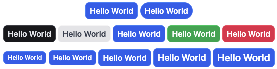
Taking what you learned and applying it to a real-world scenario: Imagine you are building a UI Library. You start to build a badge component. This component should have options to change the size, color, and format, so you can create the following style:
/* badge.css */
.badge {
  display: inline-flex;
  flex-wrap: wrap;
  align-items: center;
  justify-content: center;
  white-space: nowrap;
  padding: var(--size-1) var(--size-2);
  text-align: center;
  vertical-align: middle;
  font-size: var(--badge-font-size, var(--text-md));
  line-height: var(--badge-line-height, var(--line-spacing-md));
  font-weight: var(--font-weight-semibold);
  border: var(--badge-border, var(--border) solid var(--color-contrast-200));
  border-radius: var(--badge-border-radius, var(--rounded-lg));
  background-color: var(--badge-background-color, var(--color-contrast-50));
  color: var(--badge-color, var(--color-content-body));

  &.is-pill {
    --badge-border-radius: var(--rounded-full);
  }

  &.is-xs {
    --badge-font-size: var(--text-xs);
    --badge-line-height: var(--line-spacing-xs);
  }

  &.is-sm {
    --badge-font-size: var(--text-sm);
    --badge-line-height: var(--line-spacing-sm);
  }

  &.is-lg {
    --badge-font-size: var(--text-lg);
    --badge-line-height: var(--line-spacing-lg);
  }

  &.is-xl {
    --badge-font-size: var(--text-xl);
    --badge-line-height: var(--line-spacing-xl);
  }

  &.is-info {
    --badge-border: var(--border) solid var(--color-primary-focus);
    --badge-background-color: var(--color-primary);
    --badge-color: var(--color-primary-contrast);
  }

  &.is-error {
    --badge-border: var(--border) solid var(--color-error-focus);
    --badge-background-color: var(--color-error);
    --badge-color: var(--color-error-contrast);
  }

  &.is-success {
    --badge-border: var(--border) solid var(--color-success-focus);
    --badge-background-color: var(--color-success);
    --badge-color: var(--color-success-contrast);
  }

  &.is-contrast {
    --badge-border: var(--border) solid var(--color-contrast-800);
    --badge-background-color: var(--color-contrast-700);
    --badge-color: var(--color-content-contrast);
  }
}
Using CSS variables can give you more freedom to work with while having a consistent style.
An equivalent solution using Tailwind with @apply, even if this is not the recommended way to use the tailwind, but you can get an idea if placed inside the HTML.
/* badge.css */
.badge {
  @apply inline-flex flex-wrap items-center justify-center whitespace-nowrap py-1 px-2 text-center align-middle font-semibold;

  &:not(.is-pill) {
    @apply rounded-lg;
  }

  &.is-pill {
    @apply rounded-full;
  }

  &.is-xs {
    @apply text-xs;
  }

  &.is-sm {
    @apply text-sm;
  }

  &.is-base {
    @apply text-base;
  }

  &.is-lg {
    @apply text-lg;
  }

  &.is-xl {
    @apply text-xl;
  }

  &:not(.is-info, .is-error, .is-success, .is-contrast) {
    @apply border-contrast-200 bg-contrast-50 text-content;
  }

  &.is-info {
    @apply border-primary-focus bg-primary text-primary-contrast;
  }

  &.is-error {
    @apply border-error-focus bg-error text-error-contrast;
  }

  &.is-success {
    @apply border-success-focus bg-success text-success-contrast;
  }

  &.is-contrast {
    @apply border-contrast-800 bg-contrast-700 text-content-contrast;
  }
}
If you notice they are quite similar, but with Tailwind, you declare the properties horizontally and with CSS vertically, which gives the other a more clean aspect.
Now, checking a real-world example, like the one in the Netlify's Page, things don't look that simple anymore.
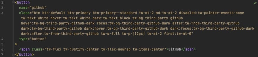
So, using the @apply mixing, you could have the best of both worlds, right? But, in this case, what would be the real benefit of writing classes using Tailwind instead of pure CSS?
Conclusion
This is just an example to give you an idea. Maybe you don't need that flexibility of using CSS and Tailwind helps to build what you need, then go for it, or perhaps your team dislikes Tailwind and this could give them a taste. Whatever your situation is, it is good to have options. Photo by Kelly Sikkema on Unsplash.
LEARN MORE ABOUT CSS IN OUR TRIBE OF DIGITAL ENTHUSIASTS
