
You don't need a JS Library for your components
Have you ever asked yourself how many times you wrote a Button component using different libraries or frameworks? Components are the base block of any Web project, but with all the changes and new frameworks appearing, it can be hard to reuse or keep them updated. As a result, increasing the development time.
To solve this problem, Web Components can simplify this process since they work natively with the Browsers and can also be integrated into any JS Framework/Library.
It is recommended to have experience with HTML, CSS, and Javascript before getting started.
In the end, you will comprehend how to create and integrate a Web Component. I will provide links containing the example while sharing my experience, caveats, and solutions I found for the most common problems when starting to develop Native Web Components.

Photo by Stéfano Girardelli on Unsplash
What is a Web Component?
A Web Component is a way to create an encapsulated, single-responsibility code block that can be reused on any page. It works by utilizing a native browser API.
The Web Component technology is older and more used than most people know. The
Building Blocks of a Web Component
The main features you need to understand to start creating your own components are:
- Shadow DOM
- HTML Templates
- Custom Elements
For this tutorial, you are going to build an alert component.
Shadow DOM
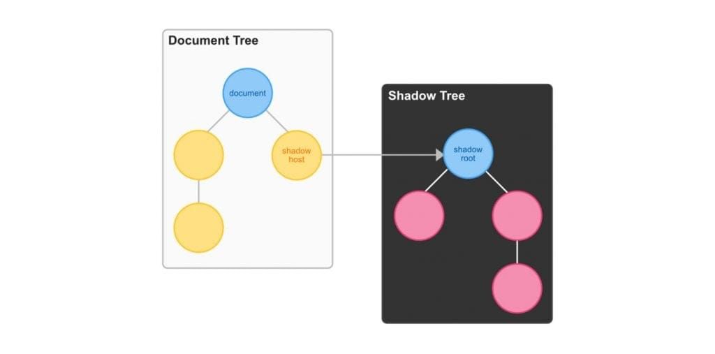
A key aspect of web components is encapsulation — keeping the markup structure, style, and behavior hidden and separate from other code on the page so that different parts do not clash and the code can be kept nice and clean. The Shadow DOM API is crucial, providing a way to attach a hidden separated DOM to an element.
Shadow DOM allows hidden DOM trees to be attached to elements in the regular DOM tree — this shadow DOM tree starts with a shadow root, underneath which can be attached to any elements you want, in the same way as the standard DOM.
Shadow DOM
In simple terms, shadow DOMs are self-contained, encapsulated blocks of code within a regular DOM that have their own scope.
HTML Templates
The HTML Templates are where you create and add the HTML markup and the CSS. You just have to write your markup inside the <template> tag to use it.
The different aspect of the template is that it will be parsed but not rendered, so the template will appear in the DOM but not be presented on the page. To understand it better, let’s look at the example below.
<template>
  <div class="alert">
    <span class="alert__text">
      <slot></slot>
    </span>
    <button id="close-button" type="button" class="alert__button">x</button>
  </div>
</template>
Since there is no native support for importing HTML files into JavaScript code, the easiest way to achieve this is to add a template tag via code in the JavaScript file and assign the HTML content with the innerHTML property.
const template = document.createElement('template');
template.innerHTML = /*html*/ `
<div class="alert">
  <span class="alert__text">
    <slot></slot>
  </span>
  <button id="close-button" type="button" class="alert__button">x</button>
</div>`;
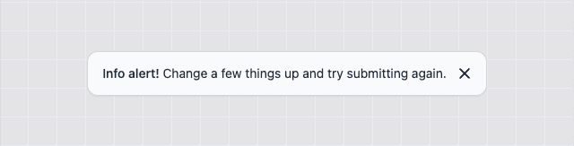
This is the draft of the component you will build and this is the result after registering and importing it:
<ce-alert>Hello there!</ce-alert>
I will explain the details on how to register and import it later and also how to add CSS styles. Furthermore, you probably notice a new tag called <slot> which is an important feature of the Web Component technology, so let’s check it out.
The <slot> element
The [<slot>](https://developer.mozilla.org/en-US/docs/Web/HTML/Element/slot) element is a placeholder inside a web component that you can fill with your own markup, which lets you create separate DOM trees and present them together, and can only be used with the Shadow DOM. The name attribute can be used to specify the target of content you want to place.
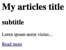
Let’s look into this example. You created a new Web Component called ce-article and it contains the following markup:
<article>
  <header>
    <slot name="header">
      <h1>title</h2>
    </slot>
    <slot name="subheader">
      <h2>subtitle</h2>
    </slot>
  </header>
  <p>
    <slot></slot>
  </p>
  <footer>
    <slot name="footer"></slot>
  </footer>
</article>
To make use of this component you could declare it as follows:
<ce-article>
  <h1 slot="header">My articles title</h1>
  Loren ipsum neros victus...
  <a href="#" slot="footer">Read more</a>
</ce-article>
Then all the content will be placed in the position you declare inside your Web Component as you can see in the image below.
Custom ElemenT
To create Custom Elements, you need to define the name and a class object representing the element’s behavior. As a rule of thumb, you should add a prefix to the component to avoid clashes with the native HTML tags, and also note that custom element names must contain a hyphen. So, in the example, you could add ce (custom element) prefix in the name of the component, like ce-alert.
Create a new Custom Element
Create a new class Alert inherited from HTMLElement and call the base constructor with the super inside the constructor method.
const template = document.createElement('template');
//...
export class Alert extends HTMLElement {
  constructor() {
    super();
  }
}
view raw
Register a new Custom Element
Next, you use the customElements.define method to register your new component.
const template = document.createElement('template');
//...
export class Alert extends HTMLElement {
 //...
}
customElements.define('ce-alert', Alert);
Custom Element Lifecycle
From the moment you create, update, or remove a custom element it fires specific methods to define each stage.
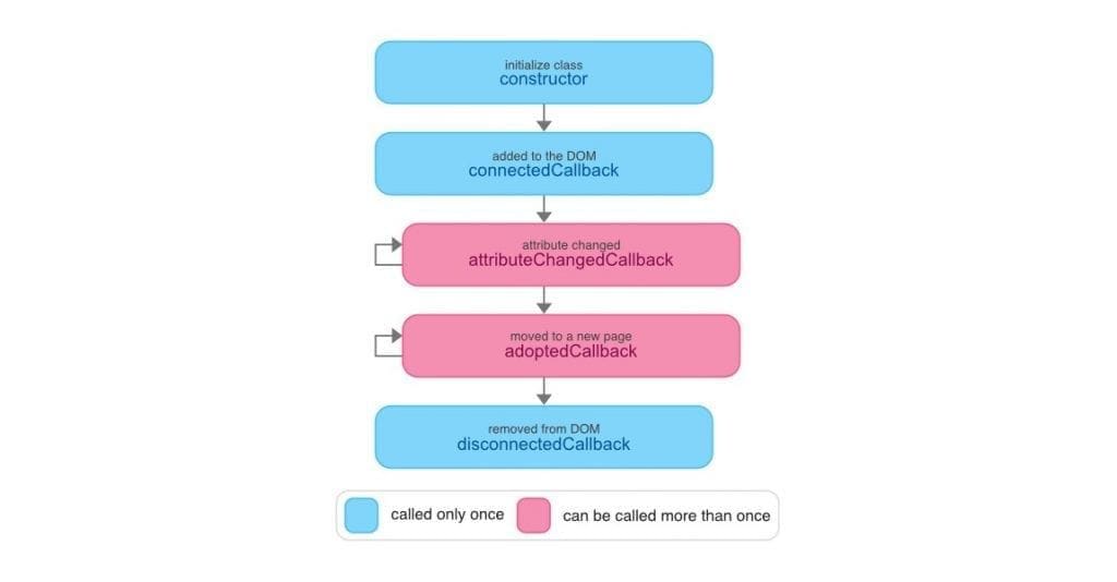
connectedCallback: Invoked each time the custom element is appended into a document-connected element. Each time the node is moved, this may happen before the element's contents have been fully parsed.disconnectedCallback: Invoked each time the custom element is disconnected from the document's DOM.adoptedCallback: An element can be adopted into a new document (i.e. using the[document.adoptNode(element)](https://developer.mozilla.org/en-US/docs/Web/API/Document/adoptNode)method) and has a very specific use case. In general, this will only occur when dealing with<iframe/>elements where each iframe has its own DOM, but when it happens theadoptedCallbacklifecycle hook is triggered.attributeChangedCallback: Invoked each time one of the custom element's attributes is added, removed, or changed. Which attributes to notice a change is specified in thestatic get observedAttributes()method
Let’s look at an example of these concepts in use.
// https://github.com/mdn/web-components-examples/tree/main/life-cycle-callbacks
// Create a class for the element
class Square extends HTMLElement {
  // Specify observed attributes so that attributeChangedCallback will work
  static get observedAttributes() {
    return ['c', 'l'];
  }
  constructor() {
    super();
    const shadow = this.attachShadow({ mode: 'open' });
    const div = document.createElement('div');
    const style = document.createElement('style');
    shadow.appendChild(style);
    shadow.appendChild(div);
  }
  connectedCallback() {
    console.log('Custom square element added to page.');
    updateStyle(this);
  }
  disconnectedCallback() {
    console.log('Custom square element removed from page.');
  }
  adoptedCallback() {
    console.log('Custom square element moved to new page.');
  }
  attributeChangedCallback(name, oldValue, newValue) {
    console.log('Custom square element attributes changed.');
    updateStyle(this);
  }
}
The class constructor is simple — here, just attach a shadow DOM to the custom element then you can append your template inside of it. The shadow mode can be open or closed. In the open state, the content inside of it can be accessed from the outside or vise-versa.
To access an element inside a custom element, you need to do query select using the custom element name, use the shadowRoot prop, then query again for the element you want.
document.querySelector('ce-alert').shadowRoot.querySelector('#close-button');
i.e. the button inside the <ce-alert> custom element.
NOTE: This is only possible when the mode is set to open while attaching the shadow root to your custom element.
To recap, the updates are all handled by the life cycle callbacks, which are placed inside the class definition as methods. The connectedCallback() runs each time the element is added to the DOM. The disconnectedCallback runs when the element is removed and the attributeChangedCallback() is called when an attribute (which is mapped in the static get observedAttributes() method) is changed.
TIP: To check whether a component is connected to the DOM, you can use
[this.isConnected](https://developer.mozilla.org/en-US/docs/Web/API/Node/isConnected)
Define attributes and properties
Attributes and properties work slightly differently from what you used to understand in a JS library/framework. Attributes are what you declare inside the HTML tag, and properties are part of the HTMLElement class you extended, and when you define a new component, it already contains a set of properties defined. So sync attributes and properties can be achieved by reflecting properties to attributes. Let’s demonstrate that with the example:
<ce-alert color="red"></ce-alert>
It is crucial to notice that attributes are always strings. Therefore, you cannot define a method, object, or number. But, in case you need another type, you have to cast it later or declare it directly inside the element object.
Now to sync the attribute with the property in the class:
//...
export class Alert extends HTMLElement {
  //...
  set color(value) {
    this.setAttribute('color', value);
  }
  get color() {
    return this.getAttribute('color');
  }
  connectedCallback() {
    console.log(this.color); // outputs: "red"
  }
}
//...
Although this approach works, it can become lengthy or tedious the more and more properties your components have. But, there is an alternative that does not require declaring all properties manually: The HTMLElement.datasets interface provides read/write access to custom data attributes (data-*) on elements. It exposes a map of strings (DOMStringMap) with each data-* attribute entry, you can also combine it with the get/set properties to have even more flexibility. But for now, update the example with the dataset declaration:
<ce-alert data-color="red"></ce-alert>
//...
export class Alert extends HTMLElement {
  //...
  attributeChangedCallback() {
    console.log(this.dataset.color); // outputs: "red"
  }
}
//...
Sync Properties and Attributes (Bonus)
This is optional, but in case you want to do the sync between attributes and properties, here is a function that can simplify this process:
/**
 * @param target - the custom element class
 * @param props - properties that need to be synced with the attributes
 */
const defineProperties = (target, props) => {
  Object.defineProperties(
    target,
    Object.keys(props).reduce((acc, key) => {
      acc[key] = {
        enumerable: true,
        configurable: true,
        get: () => {
          const attr = target.getAttribute(getAttrName(key));
          return (attr === '' ? true : attr) ?? props[key];
        },
        set: val => {
          if (val === '' || val) {
            target.setAttribute(getAttrName(key), val === true ? '' : val);
          } else {
            target.removeAttribute(key);
          }
        }
      };
      return acc;
    }, {})
  );
};
Observe Properties and Attribute
To detect attributes or property changes, you need to return an array with all values you want using the static method observedAttributes. Next, you configure the callback function attributeChangedCallback to define what will happen when the defined property changes.
//...
export class Alert extends HTMLElement {
  //...
  static get observedAttributes() {
    return ['data-color'];
  }
  attributeChangedCallback(name, prev, curr) {
    if (prev !== curr) {
      this.shadowRoot.querySelector('.alert').classList.remove(prev);
      this.shadowRoot.querySelector('.alert').classList.add(curr);
    }
  }
}
//...
Browser Integration
You can now use your Custom Element in your HTML file. To integrate, you must import the js file as a module.
<html>
  <head>
    <style>
      ...
    </style>
    <script type="module" src="./index.js"></script>
  </head>
  <body>
    <ce-alert></ce-alert>
  </body>
</html>
view raw
Custom Element Stylin
At this point, you have now a fully working Web Component, the only missing part is the styling. There are at least four ways of defining a style using CSS:
- Inline Style
- Using “part” Attribute
- CSS Inject
- Link Reference
In addition to the conventional CSS selectors, Web Components supports the following ones:
[:host/:host(name)](https://developer.mozilla.org/en-US/docs/Web/CSS/:host): Selects the shadow host element or if it has a certain class.[:host-context(name)](https://developer.mozilla.org/en-US/docs/Web/CSS/:host-context): Selects the shadow host element only if the selector given as the function’s parameter matches the shadow host’s ancestor(s) in the place it sits inside the DOM hierarchy.[::slotted()](https://developer.mozilla.org/en-US/docs/Web/CSS/::slotted): Selects a slotted element if it matches the selector.[::part()](https://developer.mozilla.org/en-US/docs/Web/CSS/::part): Selects any element within a shadow tree with a matching part attribute.
Inline Style
The initial and most common way for you could start styling your components is to declare the styles inside the template.
<template>
  <style>
    :host {
      --bg-color: #ffffff;
      --border-color: #d4d4d8;
      --text-color: #374151;
    }
    .alert {
      font-family: 'Segoe UI', Roboto, 'Helvetica Neue', Arial, 'Noto Sans', sans-serif;
      display: flex;
      justify-content: space-between;
      align-items: center;
      padding: 0.5rem 1.25rem;
      color: var(--text-color);
      background-color: var(--background-color);
      border: 1px solid var(--border-color);
      border-radius: 0.75rem;
    }
    .alert__text {
      font-size: 0.875rem;
      line-height: 1.25rem;
    }
    .alert__button {
      -webkit-appearance: button;
      cursor: pointer;
      color: var(--text-color);
      background-color: transparent;
      background-image: none;
      border: none;
      height: 2rem;
      width: 2rem;
      margin-left: 0.25rem;
    }
  </style>
  <div class="alert">
    <span class="alert__text">
      <slot></slot>
    </span>
    <button id="close-button" type="button" class="alert__button">x</button>
  </div>
</template>
The main difference here is the use of the :host selector instead of the :root selector which is not available inside the encapsulated element and cannot access global CSS variables inside the Web Component.
Using the “part” attribute
Another solution is to use the ::part selector to customize a component from the outside, making it possible to use the :root selector and create shared styles. You need to add the part attribute to the elements you want to customize, then the CSS selectors from the outside can reach in.
Let’s take a look at this example, you could update the template and change the class attribute to part.
<template>
  <style>
    //...
  </style>
  <div part="alert">
    <span part="text">
      <slot></slot>
    </span>
    <button id="close-button" type="button" part="button">x</button>
  </div>
</template>
Then, create a new CSS file and move all the style blocks into it and update the selectors to match the ce-alert component.
:root {
  --bg-color: #ffffff;
  --border-color: #d4d4d8;
  --text-color: #374151;
  font-family: ui-sans-serif, system-ui, -apple-system, 'Segoe UI', Roboto, 'Helvetica Neue', Arial, 'Noto Sans', sans-serif;
}

ce-alert::part(alert) {
  display: flex;
  justify-content: space-between;
  align-items: center;
  padding: 0.5rem 1.25rem;
  color: var(--text-color);
  border: 1px solid var(--border-color);
  background-color: var(--background-color);
  border-radius: 0.75rem;
}

ce-alert::part(text) {
  font-size: 0.875rem;
  line-height: 1.25rem;
}

ce-alert::part(button) {
  -webkit-appearance: button;
  color: var(--text-color);
  background-color: transparent;
  background-image: none;
  border: none;
  margin-left: 0.25rem;
  height: 2rem;
  width: 2rem;
  cursor: pointer;
}
NOTE: the that this selector only accepts one parameter.
To finalize, update the index.html file to import this new CSS file and that's it.
CSS Inject
Another way to customize the elements is to inject the styles inside the Web Component. First, you must create a CSSStyleSheet object that represents a single CSS stylesheet, then replace the styles and finally apply them to the shadow root. The only downside is that it requires a special polyfill to work with safari.
const stylesheet = new CSSStyleSheet();
stylesheet.replace('body { font-size: 1rem };p { color: gray; };');
this.shadowRoot.adoptedStyleSheets = [stylesheet];
You can combine it with a JS Bundler and enable PostCSS features. You need to configure it to load the CSS files as string.
If you are using Vite, append the raw suffix to import as string.
import styles from './ce-alert.css?raw';
In case you are using Webpack, you have to install postcss, postcss-loader, and raw-loader :
npm install --save-dev postcss postcss-loader raw-loader
Afterward, update the webpack.config.js file to import the CSS files as string.
module.exports = {
  module: {
    rules: [
      {
        test: /\.css$/,
        use: ['raw-loader', 'postcss-loader']
      }
    ]
  }
};
Link Reference
Link Reference is my preferred solution because you can load external CSS files without having to duplicate any code and can even be used to integrate your Web Component with a popular CSS Framework like Tailwind, Bulma, or Bootstrap.
For this example, you will integrate Tailwind with Vite. After following the setup instructions for Tailwind, create a tailwind.css file in the root level of the project:
@tailwind base;
@tailwind components;
@tailwind utilities;
Install concurrently by running the command npm install --save-dev concurrently and configure the package.json to run the tailwind compiler together with the dev server.
{
  "name": "vite-starter",
  "private": true,
  "version": "0.0.0",
  "scripts": {
    "start": "concurrently --kill-others-on-fail \"npm:dev\" \"npm:tailwind\"",
    "dev": "vite",
    "build": "vite build",
    "preview": "vite preview",
    "tailwind": "tailwindcss -i ./tailwind.css -o ./public/tailwind.css --watch"
  },
  "devDependencies": {
    "@tailwindcss/typography": "^0.5.2",
    "autoprefixer": "^10.4.5",
    "concurrently": "^7.1.0",
    "postcss": "^8.4.12",
    "postcss-import": "^14.1.0",
    "postcss-nesting": "^10.1.4",
    "tailwindcss": "^3.0.24",
    "vite": "^2.9.6"
  }
}
After that, update the index.html to include the styles and load the scripts as a module.
<html>
  <head>
    ...
    <link href="/tailwind.css" rel="stylesheet" />
  </head>
  <body>
    ...
    <script src="/src/main.ts" type="module"></script>
  </body>
</html>
Now, inside your Web Component, you can link the CSS library.
template>
  <link rel="stylesheet" href="/tailwind.css" />
  <div
    class="flex items-center justify-between rounded-xl border border-contrast-300 bg-canvas py-2 pl-4 pr-3 text-sm text-content shadow-sm">
    <span class="text-sm">
      <slot></slot>
    </span>
    <button
      id="close-button"
      type="button"
      class="ml-1 -mr-1 inline-flex h-8 w-8 items-center justify-center p-0.5 text-current">
      x
    </button>
  </div>
</template>
Final Solution
Here is the result of your new Web Component with everything you learned so far:
const template = document.createElement('template');
template.innerHTML = /*html*/ `
<style>
  :host {
    --bg-color: #ffffff;
    --border-color: #d4d4d8;
    --text-color: #374151;
  }
  .alert {
    font-family: 'Segoe UI', Roboto, 'Helvetica Neue', Arial, 'Noto Sans', sans-serif;
    display: flex;
    justify-content: space-between;
    align-items: center;
    padding: 0.5rem 1.25rem;
    color: var(--text-color);
    background-color: var(--background-color);
    border: 1px solid var(--border-color);
    border-radius: 0.75rem;
  }
  .alert__text {
    font-size: 0.875rem;
    line-height: 1.25rem;
  }
  .alert__button {
    -webkit-appearance: button;
    cursor: pointer;
    color: var(--text-color);
    background-color: transparent;
    background-image: none;
    border: none;
    height: 2rem;
    width: 2rem;
    margin-left: 0.25rem;
  }
</style>
<div class="alert">
  <span class="alert__text">
    <slot></slot>
  </span>
  <button id="close-button" type="button" class="alert__button">x</button>
</div>`;

export class Alert extends HTMLElement {
  static get observedAttributes() {
    return ['data-color'];
  }
  constructor() {
    super();
    this.shadow = this.attachShadow({ mode: 'open' });
    shadow.appendChild(template.content.cloneNode(true));
  }
  connectedCallback() {
    const button = this.shadowRoot.getElementById(`close-button`);
    button.addEventListener(
      'click',
      () => {
        this.dispatchEvent(new CustomEvent('close'));
        this.remove();
      },
      { once: true }
    );
  }
  attributeChangedCallback(name, prev, curr) {
    if (prev !== curr) {
      this.shadowRoot.querySelector('.alert').classList.remove(prev);
      this.shadowRoot.querySelector('.alert').classList.add(curr);
    }
  }
}

customElements.define('ce-alert', Alert);
Problems and Issues
There are good aspects of using Web Components as it can work everywhere, is small, and runs faster as it uses built-in platform APIs. But it is not only flowers, and there are also some things which might not work as you expected.
Attributes vs Properties
A downside of using attributes in a custom element is that it accepts only strings, and syncing the properties with the attributes requires manual declaration.
Component Update
Custom elements can detect if an attribute changes, but what happens next is up to the developer to define.
Styling
Styling can be problematic and tricky since the component is encapsulated and components like dropdowns, popups, or tooltips that require dynamic elements on top of others can become challenging to implement.
Accessibility
Because of Shadow DOM boundary common attributes like label/for, tab-index, aria-pressed, and role are not working as you expect. But, there is an alternative using the new browser API called accessibility object model.
Forms
Using forms with custom elements requires some custom form association to make it work.
SSR Support
Due to the nature of a Web Component, it cannot be used in an SSR page since Web Components rely on browser-specific DOM APIs, and the Shadow DOM cannot be represented declaratively, so it cannot be sent as string format.
Conclusion
In this article, you learned about the world of Web Components, which consists of three blocks: HTML Template, Shadow DOM, and Custom Elements. Combining them makes it possible to create your Custom HTML Elements that can be reused in many other applications. To get a little more information about building Web Components, you can check the webcomponents.dev website, where you can discover and play with different ways of making Web Components.
Try it out, play with it, and create your first Web Component for your application.
Related articles

Thiago Ferreira
Finding my voice, one speech at a time
Do you know when you watch a nice speech or talk and get inspired by that? Did you ever have the feeling of “I would like to do that one day”?
Jul 2, 2025

Inês Marques, Mariana Finkenauer, Raphael Marques
Design Meets Dev: How Collaboration Shapes Better Digital Experiences
At Mercedes-Benz.io, crafting seamless digital experiences means more than just writing code or designing interfaces - it means building together. Between design systems and frontend logic, wireframes and production, pixels and components, there’s something deeper at play: a continuous dialogue between designers and developers.
Jun 27, 2025

Eduarda Cruz, Emna Maâlej, Hélia Freire
Women in Engineering: Stories of Belonging, Growth, and the Power of Support
Engineering shapes the world we live in. But the people shaping it don’t always reflect the world around us. Women in engineering still face barriers of access, representation and recognition. But they also bring resilience, innovation, and perspective that drive progress in ways that are both measurable and meaningful.
Jun 24, 2025