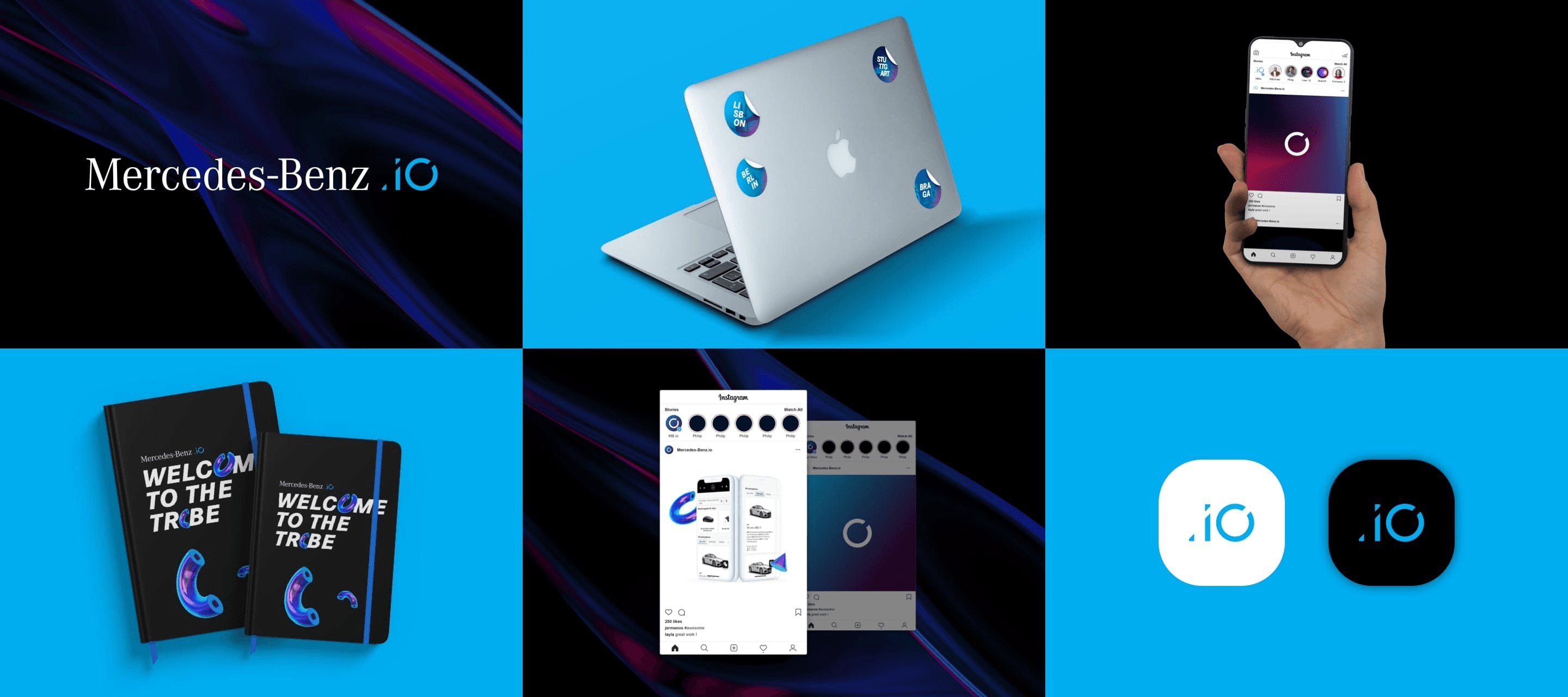
DRIVING MERCEDES-BENZ.io BRAND EVOLUTION
As many of you know or are just finding out, Mercedes-Benz.io has just celebrated its 5th anniversary, and to mark this event, we decided to roll out the plan for evolving Mercedes-Benz.io’s brand. The idea of a brand evolution has been in the works for months, but we felt that now was the perfect opportunity to stand back and take a hard look at our brand. The number of MB.ioneers is increasing, we are communicating actively in way more channels, showing up at more events, and betting on a bigger exposure of our brand. So, we need to create a bigger impact every time our brand is in the spotlight.

Celebrating 5th Anniversary
It was also important to look at the market, but most of all, to reevaluate our brand positioning as a subsidiary of one of the most popular brands in the world. I realized that our place within the Mercedes-Benz Group was not being taken fully into consideration, and our brand connection was relying too much on just our logo.
That is why we saw the opportunity for a brand evolution. And in this article, we will explain the "behind the scenes" of the changes coming to our brand, what we did and why we did it. Plus, I will tell you how nerve-wracking it is to play around with a brand and embrace color gradients in the age of dark themes and solid backgrounds.
The Brandstorming
Before approaching what we wanted to change or evolve in our brand, it was important for us to make sure we knew what needed to be kept the same - our logo. Since being more recognizable is our goal, it did not make sense to take away from all the brand-building of the last 5 years. Therefore, we also did not change our font. Although we want to be closer to the Mercedes-Benz brand, we want to keep our main visual elements and what makes our brand unique.
So, now we know the font and the logo will not change. Which makes everyone a little less scared, but also wondering, because at the end of the day what could be the substantial changes that deserve this article?
The answer to the question above is "clear" to me. As the brand designer, what was lacking in the brand was a strong visual personality. We had all the elements there, but the glue was missing. And the WOW factor was missing as well. As a driver of the Mercedes-Benz.io brand in several events, it was getting clear that our vision was not being transmitted visually in the best way possible, so we had to take all of this to the drawing board and try to produce concepts that made sense and fulfilled all the checkboxes we needed.
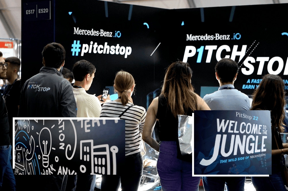
Mercedes-Benz.io Brand on events
The concept
Conceptually, we had a lot of ideas going on in our heads. Therefore, we tried to stick with keywords that would help us find a clear path that we could later transform into visual assets. The most predominant ones were the ideas of movement, modernity, luxury, and adaptability. Capable of being like water. Ready for everything. For every change. And adapt accordingly with the same ability as ever.
It was with all of this in mind that we agreed on these main changes.
We shifted our color palette by changing our complementary color from a bright green to a strong pink, while keeping our signature sky blue as the main color. We also brought in a fresh cohesive approach to our art direction and photography. And we have further developed our shapes into 3D ones, so we can give more depth and movement to the way we present ourselves. Let us now do a deep dive into these changes.
Movement, modernity, luxury, and adaptability
From Green to Pink to Gradients.
I will be honest, the revamp started here. The idea started here, in April 2022, when I tried to see how pink would work with our blue. And then how they would work in a gradient. In my opinion, it worked perfectly. We wanted to show fluidity, modernity, and the capability of adapting. The gradients give us that. Not only does pink supply all the contrast green did not, but it also revealed itself by being an amazing gradient partner to our blue. It allowed us to have fluid, vibrant gradients that uncover purple in most of them. And this is important, why may you ask? Well, purple is a color highly related to Luxury, which is the overall Mercedes-Benz purpose. This allows us to get closer, without losing our identity.
From 2D to 3D Shapes
Our shapes always gave us room to play around. They are great for patterns and monochromatic designs. However, they lack depth. And this, added to their lack of texture, can make it hard for our brand assets to stand out amongst other tech companies while being side by side in events, for example. Therefore, we have created alternatives. We have not crossed the 2D shapes from our brand book. We just introduced their 3D variants, with a fresh look that can be used whenever we want to have more personality and need shapes to create a "standing from the crowd" design.
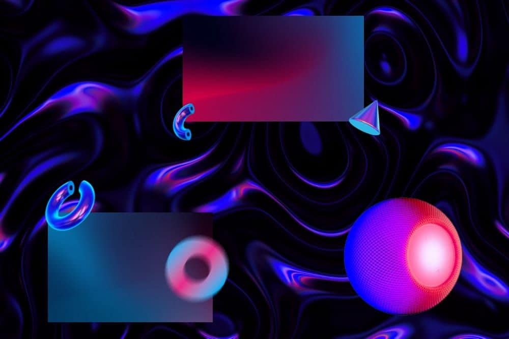
Shapes and Backgrounds for the future
Cohesive Photography
We felt that we had a challenge with photography cohesiveness, due to having four different offices and relying on a lot of photos taken in each one of those offices.
For this reason, we made the decision to expand our team with a Media Producer who handles our visual assets, including taking all photos with the same clear vision, creating the unified feeling that was missing from our media. The same goes for our videos, where we were able to explore our visual language and personality, while keeping the cohesiveness of our brand identity.
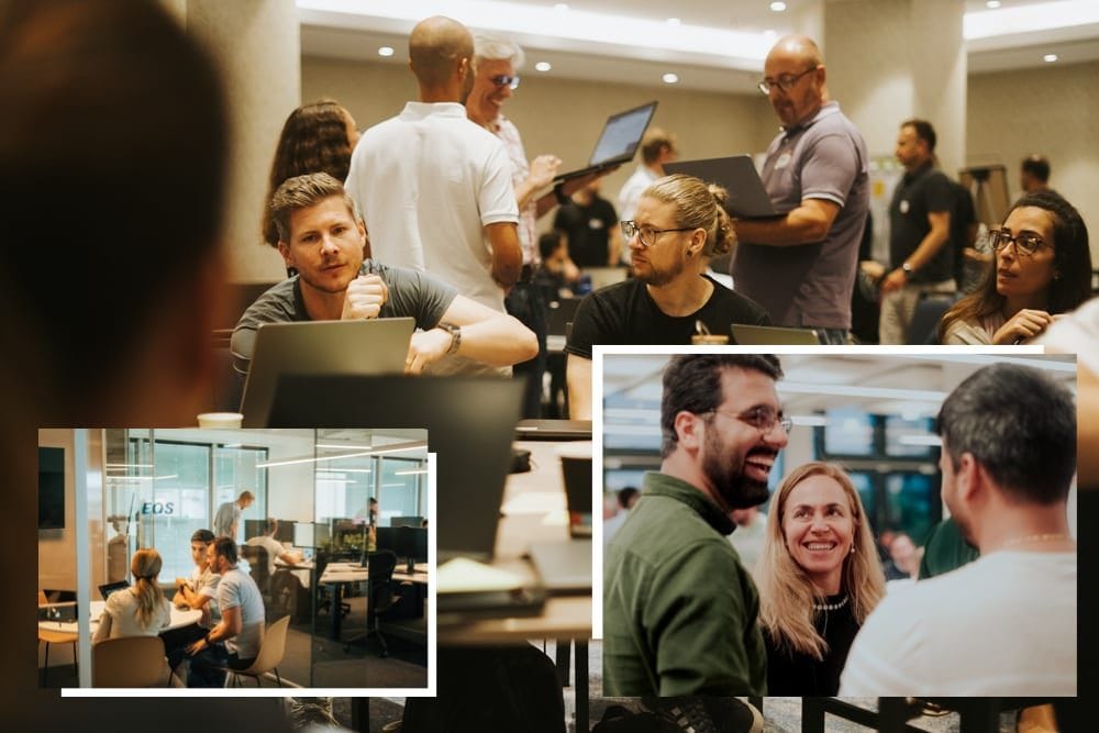
Have you seen our amazing Lisbon office?
Modern Iconography
Regarding our iconography, we felt that it was lacking modern aesthetics and was too thin-lined. This could result in a loss of power when being put against other elements in a PowerPoint deck. Thus, we decided to shift towards an icon library that is more inclined toward digital platforms, with wider lines and less detail, since they were not being used in printing assets.
Wrapping it all up:
We are really excited about this brand's evolution and all the wonderful things that can come with it. We want to stand out and be recognizable. This requires bold moves from us, which should not mean we lose any of our values and personality traits. That is why we decided to keep our main brand assets intact, adjust what could be improved, and be creative with what we have in our hands.
Since a picture is worth a thousand words, I will leave it up to all the designs you will be able to check throughout our communication channels, to WOW you as they have WOWed us. And hope you feel as connected to our brand and get as excited as we are.
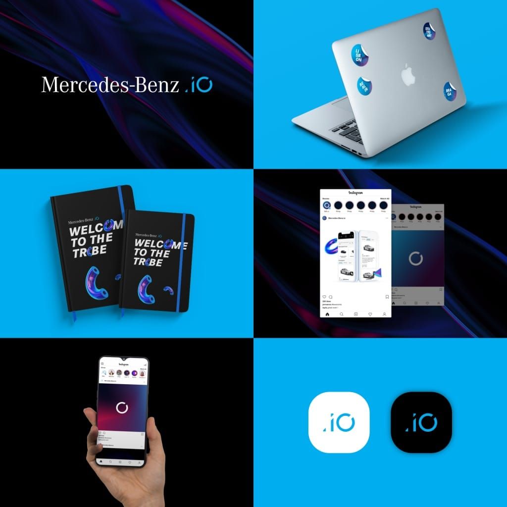
Examples of the brand's evolution applications
Related articles
Naz Ersoy
Structure Meets Story: How Content Integration Shapes Global Experiences
Content has always been part of digital products, but in today’s complex global ecosystems, it’s no longer just about what gets published. For Naz Ersoy, Content Integration, it is the bridge that makes things work across tools, teams, languages, and experiences.
Dec 9, 2025
Vera Figueiredo
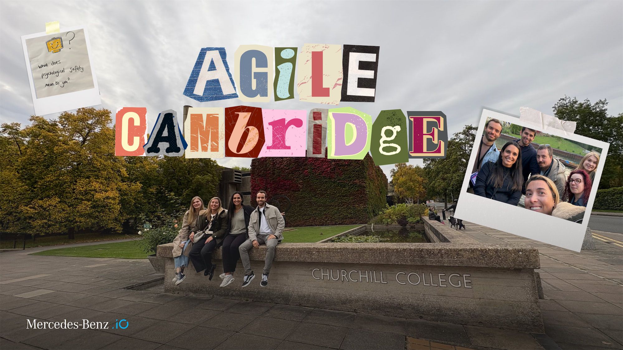
Agile Cambridge 2025: A Human-Centred Journey into Agility, AI, and Collaboration
When Vera Figueiredo, Scrum Master, stepped into Agile Cambridge 2025, she wasn’t just attending another industry event. She was entering a space that felt alive, buzzing with curiosity, openness, and a genuine willingness to share.
Dec 2, 2025
Asad Ullah Khalid
Between Interfaces and Insight: A Frontend Story Built on Curiosity
In the world of Frontend Engineering, appearances can be deceiving. Ask Asad Ullah Khalid, and he’ll tell you: this field isn’t just about crafting “pretty UIs”, it’s a layered, evolving space that balances engineering, creativity, architecture, and empathy. It sits right at the intersection of user experience, backend logic, and business goals.
Nov 21, 2025